How To Incorporate The Latest Color Trends in Your Home
After years of gray, the design world is embracing a more natural color palette

GUACAMOLE | PHOTO COURTESY GLIDDEN PAINTS
The interior design world is exploding with the colors of nature — and not a moment too soon. For more than a decade, easy, unassuming gray has led the way, encompassing everything from paint to floors to furniture. However, as we begin 2022, the future is looking decidedly verdant.
Going Green
Gorgeous greens are finding their way onto everything from walls to furniture to kitchen cabinets. It’s a surprising perfect neutral, one that pairs nicely with natural woods, shades of black and everything in between.
The hue also works well with complementary hues of yellow, gold and copper — and it is the perfect offset to those interiors that were only recently painted gray.
It appears the world’s leading color experts agree; color of the year announcements from all of the major paint manufacturers for 2022 landed firmly in nature’s backyard.

EVERGREEN FOG | PHOTO COURTESY SHERWIN-WILLIAMS
Sherwin-Williams chose a green-gray shade, Evergreen Fog, as its Color of the Year, while Behr went with a beautifully light and crisp blue-green shade called Breezeway. Valspar announced Blanched Thyme, a cool, organic green, as its choice for 2022; Glidden settled on the very fun Guacamole.
At Benjamin Moore, the experts chose October Mist, a gentle green that’s perfect for a quiet bedroom or subtle kitchen, while PPG Paints decided on Olive Sprig, an earthy green, as its Color of the Year. The hue was tied to the overarching theme of ‘Horizon,” a state of reflection indicating hope for the future. The shade pairs well with neutrals and also sets a soothing backdrop for a supportive design palette that brings to mind nature, antiquity and fresh beginnings.
Luxury brand Farrow & Ball announced Breakfast Room Green would lead the way for 2022. Pairing well with yellow and red woods alike, the pure, saturated green looks to be straight from the garden.
In a new collaboration, the British company also aims to take the confusion out of pairing paints with prints by partnering up with iconic UK wallpaper brand, Liberty. Their curated custom paint palette showcases 15 hand-picked combinations of colors, fabrics and wallpapers for traditional, modern and youthful interiors.

OLIVE SPRIG | PHOTO COURTESY PPG PAINTS
Wild Wallpaper, Warm Whites and Beyond
Speaking of wallpaper, if you are not seeing it everywhere, you’re not looking very hard.
Prints featuring spotted leopards, bright birds, florals and fantasy wonderland scenes are dominating the design landscape. Many companies sell peel-and-stick versions of their wallpaper, but these versions are just as much work as the traditional application. Because advances in technology have made wallpaper implementation and removal so easy, my advice is to dive right into the real thing.
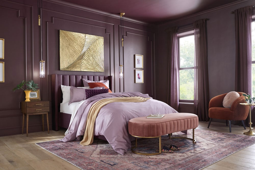
If neutral hues are more your thing, consider using saturated versions, which are replacing the pure gray shades that have been popular for years. Also on trend are grays with violet undertones and warm greiges. Adding a touch of comfort are on-trend rich coppers, browns and golds,which give an inviting, enveloping feeling to your spaces.
Another fresh trend is warm whites paired with natural wood. Plaster walls and finishes — think Italian countryside meets farm chic — can also add texture to any neutral-hued space. Found in the Italian countryside and southern Europe, the style has been embraced by designers such as Pittsburgh native Leanne Ford, co-star of HGTV’s “Home Again with the Fords.”
Encaustic tiles with patterns from the old world also are emerging in kitchens and baths — and they’re not going away anytime soon. Tile is rising as a practical complement to colorful paints or warm white shades when revamping a space.
In fact, hand-painted tile walls and floors have been used in Europe for centuries as a colorful and eco-friendly design element. You can expect patterned tile to trend outside this summer as homeowners expand their outdoor spaces, gardens and pathways.
As we continue into 2022, you can also look for nature-inspired colors to expand onto exteriors via rich greens, coppers and browns. If you’re thinking about incorporating these hues into your own home, black and gray shades provide the ultimate backdrop for these palettes.
Now dive in and pick a shade — and let others grow green with envy at your new color choices.
Inspiration
Rosa Colucci shares some of her favorite Instagram design accounts.

THE RICH COLORS AND PRACTICALITY OF OLD-WORLD TILE, SUCH AS THESE HAND-PAINTED PATTERNS FOUND DURING COLUMNIST ROSA COLUCCI’S RECENT TRIP TO ITALY, ARE INSPIRING NEW DESIGN TRENDS IN 2021 | PHOTOS BY ROSA COLUCCI
Corey Damen Jenkins
Known to the public from his television appearances on HGTV and The Rachael Ray Show, this nationally acclaimed designer was inducted into Architectural Digest’s prestigious AD100 and Elle Décor’s A-list. His new book, “Design Remix: A New Spin on Traditional Rooms,” is bursting with colorful interiors and sage advice for choosing patterns — as well as how to give your mom’s armoire a modern vibe. Don’t miss his just-released series on MasterClass (it’s one of the best out there) and make sure to check out his library at the Kips Bay Decorator Show House-Dallas. The blue silk covering the ceiling is the stuff dreams are made from: @coreydamenjenkins

Sarah Richardson.
This Canada-based design industry veteran has proven her mettle with several award-winning television shows, books and her own line of furniture, wallcoverings and fabrics. Whew! You’ve seen her work on the cover of every major design magazine — and her approachable, distinct style is so much fun. Her latest offering is a book series called “Collected.” Each one unpacks the design process and takes you behind closed doors to the sources, inspiration and changes that created the wow-worthy spaces. The just-released “Colour + Neutral, Vol. 3” explores neutrals and soft palettes, textures and treatments in ways that avoid boredom and create unique, enveloping spaces. This book joins “Past + Present, Vol. 2” and “City + Country, Vol. 1.” The entire collection is a must-have for design enthusiasts and professionals alike: @sarahrichardsondesign

Rifle Paper Co.
Since 2009, Nathan and Anna Bond have been creating a world full of bold color on stationery, fabrics and beyond that are covered with Anna’s whimsical designs. Their wallcovering collection with Pennsylvania-based York Wallcoverings is a sheer delight. With more than a million followers on Instagram, it’s fun to see the creative ways the prints are being used in the home: @riflepaperco or @york_wallcoverings
Hot Property columnist Rosa Colucci, ASID, IP contributes to Pittsburgh Magazine’s weekly newsletter, Nest. She is national color educator and color consultant for PPG Paints and spends her days making the world a more colorful place for all.